It often happens, that you have to create a visual interactive online presentation of your info and to make it real quick. Or you have a geographical map and you want to add customizable markers with attached detailed information. There are many ways to achieve it, but most of them take time. We’ve created a tool, which solves the issue. Ladies and genlemen, we give you „WhatMatters“! A very simple and transparent tool, that allows to bring online your diagrams, blueprints, charts, layouts and generally attach textual and graphical info to the active areas in a very short time.
But let us illustrate it by example and explain how it actually works. On the start screen you have to fill a simple registration form and log in. Takes a few seconds.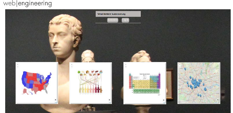
After logging in you create a new project, give it a name and cathegorize it if you plan to add multiple cross linked infographics. Or leave it with just a name if it’s a standalone project. On this step you also have to decide whether it will be a map (in this case you enter start geo coordinates and start zoom value) or an image (you must in this case upload it)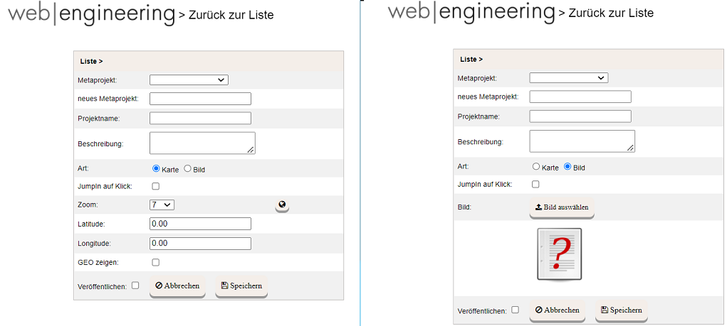
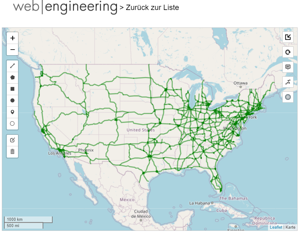
Now you’re ready to add a content to your graphics. Let’s say you’ve chosen a map of United States (Latitude: 38.0000, Longitude: -91.0000, Zoom: 4) You would like to add the network of American highways. It can be done manually, by meticulously adding polylines, using the tool palette on the right, but as a rule there are a wide range of predefined shape files available in the Internet. For this demo I’ve found a corresponding shape file and imported it (see the ‚globe‘ icon on the right), which took about a minute. Here is the result.
Now every polyline, that represents a highway, is an active object. When you click on it on the map it gets highligted and you may attach the necessary information by clicking the ‚pencil‘ icon in the right bottom part of the screen and typing or pasting the text in the WYSIWYG-editor window in the center. You can also include pictures, files-to-download and links. The latest can be internal, referring to other WhatMatters projects or external.

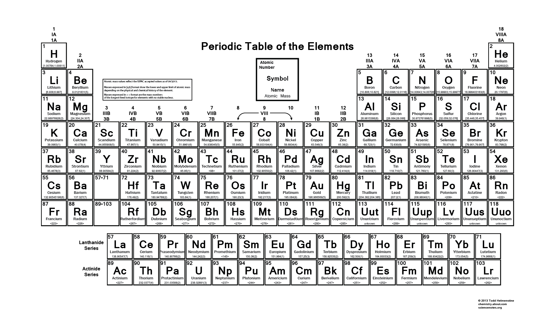
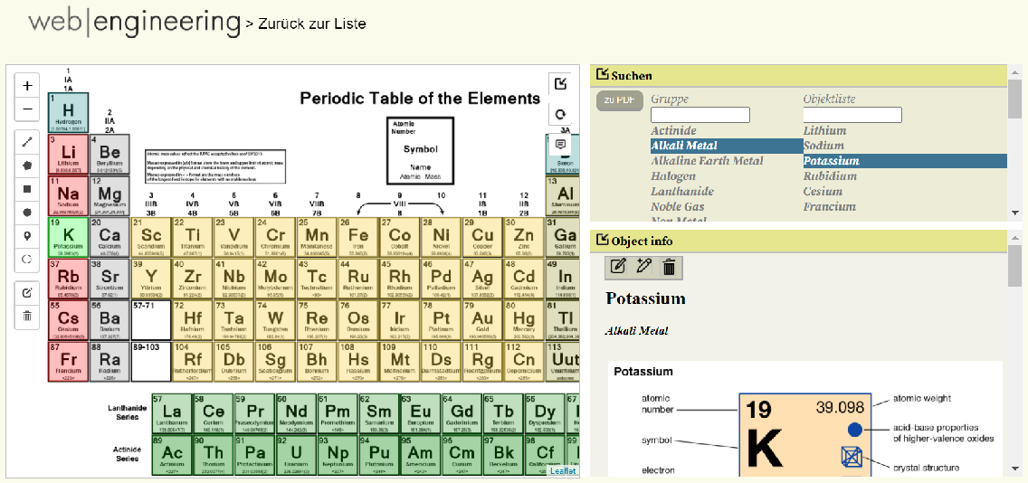
Now let us suppose we’ve chosen an image rather than a map. To keep it simple I’ve uploaded the periodic table of elements, familiar to us from the school chemistry class. As you can see the image itself is not interactive, it’s our task to add an active areas.
These active arias can be Polylines (like in the case of American highways in the previous example), Polygones , Circles, Rectangles, Markers and Round Markers. Each of the active elemens is available in the palette on the left side of the working area. Naturally for the Table of Elements the natural choice is rectangels, but we could use circles or markers if we’l prefered it that way. We add as many rectangles as the number of elements, adjust their color, transparency, give each of them a name and a group if necessary and then attach an text and graphic information to each of them the same way as we did on a map.
After the project is done, we publish it. Bingo! Your presentation is online and ready to use. There are quick search area, info area and image area. All of them can be expanded/collapsed if necessary. Also there’s a possibility to export it to PDF format and download the document for printing. Here’s a screenshot of the finished ‚Periodic Elements‘ project.
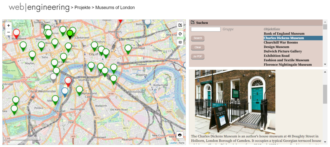
Another example of a ‚Museums of London‘ project, where we used markers and a map.
All in all, whether we choose map or a background image, polylines, circles or rectanges, to create a simple standalone presentation or a complicated crosslinked portal, you are only limited by your imagination!
Leave a Reply